garycoffey15 Posted July 17, 2012 Report Share Posted July 17, 2012 After a goood deal of time I have gotten my hands on EFC once again and I will begin Operating out of Hilo as soon as I have a Roster in Order. I was beginning to loose interest in the game but to try and Revive that I said I would try and re-establish EFC as one of the top ORGs in the game. I actually opened EFC the same day I started playing MMA Tycoon over 2 years ago and spent most of my time running it in the shadows of the Hilo super ORG that was Blitz. I am looking for someone to do a design for a Logo and Banner, Submit entries on the thread and I will give 200k to whom ever comes up with my favourite design!! Really Looking forward to this And I would love to welcome back any manager who has fought under The EFC banner before, Im sure you had a good experience fighting for us...... Quote Link to comment Share on other sites More sharing options...
Guest Posted July 17, 2012 Report Share Posted July 17, 2012 Gary ran a great org before and I'm sure he'll do it again. Can't wait to see what he comes up with! 3 Quote Link to comment Share on other sites More sharing options...
garycoffey15 Posted July 17, 2012 Author Report Share Posted July 17, 2012 Cheers Shiv, No Blitz there to Motivate me this tho lol Quote Link to comment Share on other sites More sharing options...
Guest Posted July 17, 2012 Report Share Posted July 17, 2012 Gary ran a great org before and I'm sure he'll do it again. Can't wait to see what he comes up with! Gary has always run great orgs. EFC obviously the most successful. Glad to hear that it is coming back. 1 Quote Link to comment Share on other sites More sharing options...
garycoffey15 Posted July 17, 2012 Author Report Share Posted July 17, 2012 Thanks Cooper,Yeah I used to be pretty passionate about EFC none of the other ORGS really lived up to it for me. Felt more like work where as I enjoyed running EFC. Quote Link to comment Share on other sites More sharing options...
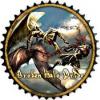
Legend2204 Posted July 17, 2012 Report Share Posted July 17, 2012 http://img641.imageshack.us/img641/9720/efc1.jpg http://img696.imageshack.us/img696/6667/efcbanner1.jpg 4 Quote Link to comment Share on other sites More sharing options...
garycoffey15 Posted July 17, 2012 Author Report Share Posted July 17, 2012 I like it man That will be hard to top. I remember right I think you used to be one of my 1st poster makers ? Quote Link to comment Share on other sites More sharing options...
Legend2204 Posted July 17, 2012 Report Share Posted July 17, 2012 Yeah, that was me. I couldnt pass up the chance to do the new EFC logo Quote Link to comment Share on other sites More sharing options...
Guest Posted July 17, 2012 Report Share Posted July 17, 2012 Bump for my boy Gary! Great org, would recommend to all. 1 Quote Link to comment Share on other sites More sharing options...
haystax Posted July 18, 2012 Report Share Posted July 18, 2012 http://img641.imageshack.us/img641/9720/efc1.jpg http://img696.imageshack.us/img696/6667/efcbanner1.jpg Why the two shades of red in the logo? Or are my eyes playing tricks on me? Outside that, really clean work man. Quote Link to comment Share on other sites More sharing options...
Dee Posted July 18, 2012 Report Share Posted July 18, 2012 1342538588[/url]' post='380263']http://img641.imageshack.us/img641/9720/efc1.jpg http://img696.imageshack.us/img696/6667/efcbanner1.jpg I would like to see gloves or at least shorts for the guy in the logo tbh. Like this it's a bit too manly for my taste. Other than that A VERY nice job imo. Quote Link to comment Share on other sites More sharing options...
Legend2204 Posted July 18, 2012 Report Share Posted July 18, 2012 Why the two shades of red in the logo? Or are my eyes playing tricks on me? Outside that, really clean work man. Thanks for the feedback guys I was trying to give it a bit of gloss but it obviously didn't work out too well. It can easily be removed or changed if my design's end up winning & Gary doesn't like/want something. Quote Link to comment Share on other sites More sharing options...
garycoffey15 Posted July 18, 2012 Author Report Share Posted July 18, 2012 Seems to be topping the poles at the moment, all the entries just flying in lol Quote Link to comment Share on other sites More sharing options...
garycoffey15 Posted July 19, 2012 Author Report Share Posted July 19, 2012 I really thought for 200k there would be more entries :/ Quote Link to comment Share on other sites More sharing options...
PBR Posted July 19, 2012 Report Share Posted July 19, 2012 think the first entry scared them off -- lol -- its pretty nice clean design -- dont think i could do any better but i might give it a try here later Quote Link to comment Share on other sites More sharing options...
garycoffey15 Posted July 19, 2012 Author Report Share Posted July 19, 2012 yeah dont get me wrong really like the design but was hoping for a few to choose from Quote Link to comment Share on other sites More sharing options...
Coop32 Posted July 19, 2012 Report Share Posted July 19, 2012 I'll give this a shot... Quote Link to comment Share on other sites More sharing options...
garycoffey15 Posted July 19, 2012 Author Report Share Posted July 19, 2012 I'll give this a shot... Do see what you can come up with?? Quote Link to comment Share on other sites More sharing options...
Coop32 Posted July 19, 2012 Report Share Posted July 19, 2012 http://img513.imageshack.us/img513/7905/exc1l.jpg http://img513.imageshack.us/img513/7905/exc1l.jpg Quote Link to comment Share on other sites More sharing options...
Coop32 Posted July 19, 2012 Report Share Posted July 19, 2012 Can finish the banner/thumb if won... also, this more basic text based.. http://img207.imageshack.us/img207/1696/exct2.jpg Quote Link to comment Share on other sites More sharing options...
toejam98 Posted July 19, 2012 Report Share Posted July 19, 2012 another good 1, nice job! one thing about both logos is they have a more old school UFC logo type look to them, maybe someone can come up with a futuristic more developed look to it Quote Link to comment Share on other sites More sharing options...
Dee Posted July 19, 2012 Report Share Posted July 19, 2012 Can finish the banner/thumb if won... also, this more basic text based.. http://img207.imageshack.us/img207/1696/exct2.jpg Wow that's pretty damn nice lettering. Any links to a tutorial where this one is explained would be awesome... =) Quote Link to comment Share on other sites More sharing options...
markyosullivan Posted July 19, 2012 Report Share Posted July 19, 2012 Glad to see Gary running another org. Used to hear a lot about his old org. Good luck man, not that you'll need it 1 Quote Link to comment Share on other sites More sharing options...
toejam98 Posted July 19, 2012 Report Share Posted July 19, 2012 oo i just saw the test based one, that looks cool as fuck sorta like a fight club feel to it Tutorial - Grundgy back ground --- Fill background Black, Take grundge brush white and click a few spots. Then create a new layer, brush some brown color set on overlay or soft light Cool little Red Things - new layer, circle brush, black, brush 2 big dots. Take eraser, get the dot eraser make it smaller at the top of big circle erase a little circle. Go to Layer Properties, I think its a stroke with a black gold gradient. Now create a new layer, take a soft brush, make blotch of red in the black cirlce things, take smudge just the soft circle brush and smudge it out so it looks good. Text - just black text with same thing as the circles have, think it's a stroke & gradient. Quote Link to comment Share on other sites More sharing options...
Coop32 Posted July 19, 2012 Report Share Posted July 19, 2012 ^^^ not how it was done...although I'm sure that would/could look similar. It's basically created using blending options....I'll send the .psd if anyone is interested.... Quote Link to comment Share on other sites More sharing options...
Recommended Posts
Join the conversation
You can post now and register later. If you have an account, sign in now to post with your account.